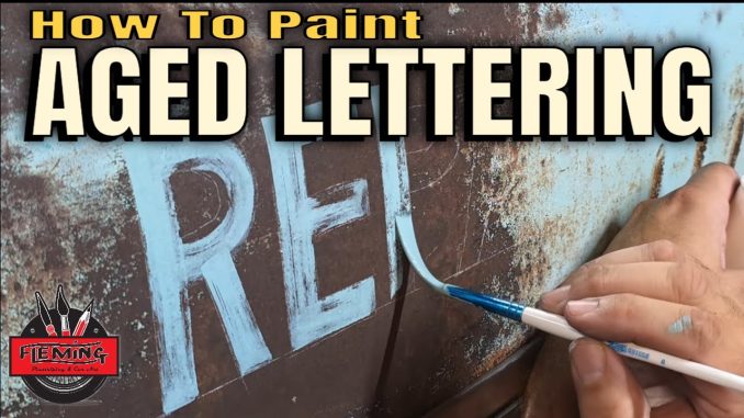
Jack Fleming Artistry brings us a satisfying blend of surface history and precision craft in this tutorial: how to paint distressed lettering and add gold leaf accents on a patina 1957 Chevy gasser wagon. Whether you’re into rat-rod patina work, lettering for classic cars, or just love shiny gold details set against weathered metal, this step-by-step walkthrough shows how to make brand-new lettering look like it’s been on the car for decades — while preserving a crisp gold leaf flourish where it counts.
A quick setup: Jack’s working on a 1957 Chevy four-door wagon that was literally pulled out of a field and converted into a gasser. Right now it’s running a diesel while the owner builds a blown LS for the future — but what makes the project sing is that they’re keeping the wagon’s rough, “death-trap” patina. Jack’s mission is to paint lettering that matches that lived-in look and then highlight a section with true gold leaf, leaving the leaf bright against a distressed background.
Why distress lettering?
Distressing is about storytelling. Fresh paint can look out of place on a patina car; distressed lettering reads correctly with the rest of the finish and suggests age, sun, wear, and a history of use. Jack’s approach is to let the surrounding paintwear look authentic while keeping the gold leaf element intentionally pristine — a contrast that adds depth and visual interest.
What you’ll see in the tutorial
Jack walks through every step he takes, and the video is ideal if you want both practical technique and an explanation of why things are done a certain way. Highlights include:
- Preparing the surface so new paint will sit correctly without erasing the existing patina.
- Laying out lettering and choosing the right scale and spacing for a gasser wagon’s proportions.
- Painting the base lettering, then selectively scuffing and abrading areas to mimic decades of wear.
- Techniques for distressing that preserve letter shapes while adding believable irregularities.
- Applying gold leaf: tips on sizing, laying sheets, burnishing, and protecting the leaf so it stays bright.
- Finishing touches that blend the distressed paint with the shiny gold for a cohesive look.
Practical tips you can use
Jack emphasizes tools and tactics that make the distressing realistic — think selective sanding, feathering edges, and using solvents and brushes to lift paint in controlled ways. For gold leafing, he stresses patience: proper sizing (adhesive), careful placement, and gentle burnishing are what keep the gold crisp and durable. The video shows these steps slowly and clearly, so you can follow along even if you’re new to gilding.
Who should watch this
If you’re restoring or customizing patina cars, working on signage, or just love the blend of weathered paint and luxe accents, this tutorial is a treasure. It’s especially useful for letterers, pinstripers, and hobbyists who want to learn how to age graphics convincingly while still making certain elements pop.
Final thought
Jack Fleming Artistry’s video is a great lesson in balancing care and cruelty — we deliberately make some parts of the paintwork look beaten and aged while protecting and celebrating others with gold leaf. The result is a layered, characterful finish that feels authentic to the car’s story and exciting to the eye. If you like craftsmanship with a bit of grit and a touch of bling, this one’s worth a watch.


